Every palette we propose is chosen twice — once for how it looks across the room, and once for how it will look across a lifetime of photographs. The two are not the same. A colour that dazzles under daylight can flatten under tungsten; a neutral that reads beige in a swatch can glow on camera. The palettes below have earned their place in our studio because they perform in every light.
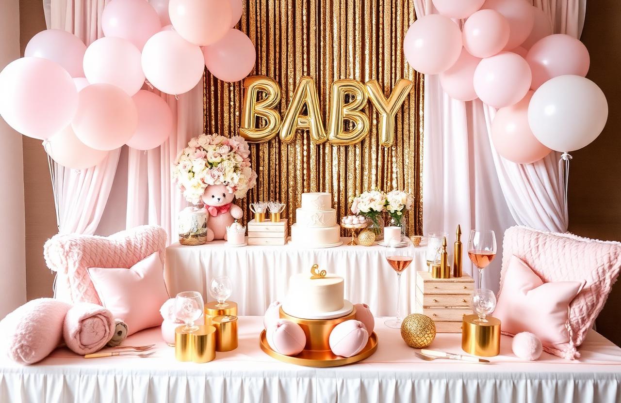
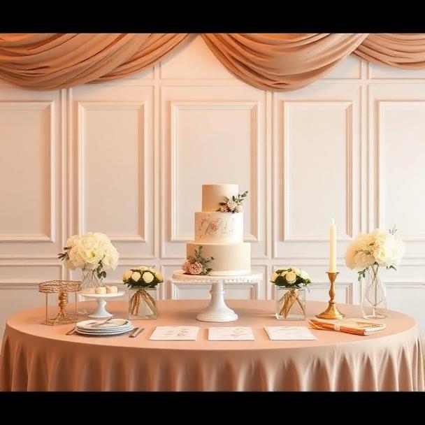
Blush & champagne
Our most-requested wedding palette, and for good reason — blush flatters every skin tone, champagne catches every candle, and the two together read romantic without ever tipping into sweet. We pair them with bone, taupe, and the gentlest hint of dusty rose to keep the room dimensional.
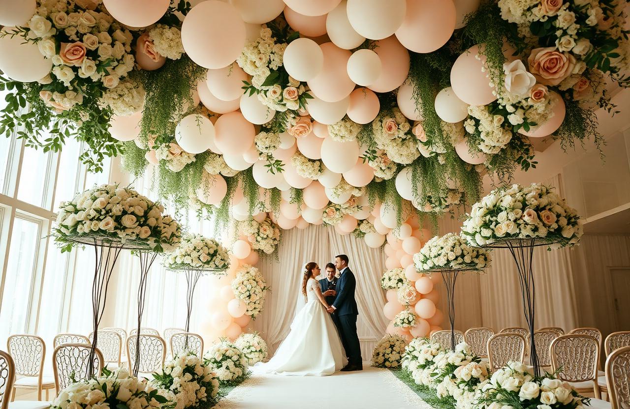
Ivory neutrals
Ivory, oat, mushroom, parchment. A palette built almost entirely from neutrals is the surest way to photograph timelessly — there is no trend to date it, and warm whites are universally flattering in candlelight. The texture does the heavy lifting: raw silk linens, unbleached linen napkins, garden florals in cream and ecru.
“The most timeless weddings we have designed are almost entirely neutral. Colour is the accent — never the headline.”
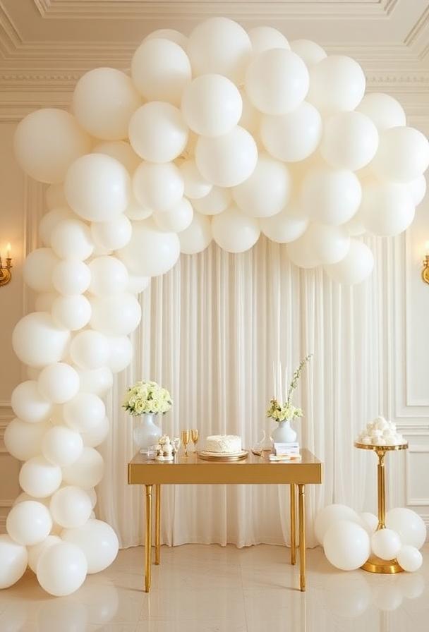
Soft black & ivory
Editorial, architectural and unmistakably modern. Soft black — never true black — paired with ivory creates the kind of contrast that magazines love. We use it for city weddings, gallery venues and any couple whose taste runs more Céline than country garden.
Muted earth tones
Terracotta, sage, sand, ochre. The palette of choice for outdoor weddings — it reads as if the celebration grew out of the landscape itself. On camera, earth tones translate beautifully in golden hour and hold their dignity under string-lit canopies once the sun has dropped.
Modern monochrome
A single colour, taken seriously — head-to-toe blush, an entirely champagne ballroom, a wedding washed in dove grey. Monochromatic styling photographs unforgettably because the eye has nowhere to land but the people. It requires a confident couple. We love it for them.
Why these palettes photograph well
- They favour warm temperatures (2700–3000K) — flattering in candlelight and in editing
- They use no more than three core tones, so the camera reads them as composition rather than clutter
- They are built around neutrals, then accented — never the other way around
- They tolerate venue conditions, from chandeliered ballrooms to garden marquees
A palette is a love letter from the couple to the room. Chosen well, it does not date — it deepens.